Wednesday, January 15, 2014
CAROLYN'S STRONG: THE POWER OF FREEDOM
Lois' STRONG Quilt
I pondered a long time about the different types of strong. It was such a good theme, so many options, thank you Tricia. I kept going back and forth with the strength animals - As we just returned from a South African Safari trip, where the brute strength of these animals in their natural setting was awesome to behold, and the mascots in schools of animals used to depict Strong in a collegiate mascots. Not being from the South and witnessing the strength of the support for Southern Conference Schools - their loyalty to the Mascots, Flags and Banners of these teams everywhere, and the strength of their followings have intrigued me. So I decided to combine them in my own version of strong.
I appliqued on the red letters - obviously to give the piece a collegiate feel as my last step.
I did my applique on untreated cotton canvas. I drew the elephant on white velum, and used Fantastic All purpose inks, and their fine tip applicators and alcohol to paint on the fabric, I wet the fabric first, did my drawing to size on paper, then taped it down, pinning the fabric over it, so I could see through the marker drawing done in permanent marker thru the thin cotton untreated white fabric. By wetting the fabric i was able to blend my colors better and not get harsh lines from the ink. Be sure to put plastic under the whole project so your table surface stays clean.
After the painting was done and dry, I ironed it, then cut it out. I sprayed the back of it with Web Bond TA 101 and ironed it in place on the canvas. Then I started thread painting with my new Sweet Sixteen.
When the elephant was completed, I decided it needed more texture so I put canvas colored thread in my machine and started free motion drawing, beige on beige on the canvas. It was a fun piece to do,and I learned a
lot about using the inks as well as practicing thread painting, which I am becoming obsessed with!!!!
I appliqued on the red letters - obviously to give the piece a collegiate feel as my last step.
I did my applique on untreated cotton canvas. I drew the elephant on white velum, and used Fantastic All purpose inks, and their fine tip applicators and alcohol to paint on the fabric, I wet the fabric first, did my drawing to size on paper, then taped it down, pinning the fabric over it, so I could see through the marker drawing done in permanent marker thru the thin cotton untreated white fabric. By wetting the fabric i was able to blend my colors better and not get harsh lines from the ink. Be sure to put plastic under the whole project so your table surface stays clean.
After the painting was done and dry, I ironed it, then cut it out. I sprayed the back of it with Web Bond TA 101 and ironed it in place on the canvas. Then I started thread painting with my new Sweet Sixteen.
When the elephant was completed, I decided it needed more texture so I put canvas colored thread in my machine and started free motion drawing, beige on beige on the canvas. It was a fun piece to do,and I learned a
lot about using the inks as well as practicing thread painting, which I am becoming obsessed with!!!!
Jane's Strong Quilt
Strong
“Strong” is a wonderfully
inspiring theme for a quilt. My first inclination was to use the image
of a tree. Trees are very strong. I could see the huge oak tree in my father’s
yard, the windswept trees clinging to a cliff or canyon wall, or the willow
tree that bends with the wind. However, while I was considering the tree, we
had an ice storm. It wasn’t a horrible ice storm, but it coated the limbs and
broke several. Three fell on the studio roof. Many trees around town fell over
and quite a number of people were left without electricity. It made me think
about water. Water created the Grand Canyon and many caves. The giant
Mississippi River continues to be a force to be reckoned with each spring. The
frozen water can break the trees.
I had an experimental piece on my design wall begging to be finished.
I started with canvas as a backing. At the time I was interested in
multidimensional work, so I used alpaca fibers and yarns for the batting. It
was not real batting. On top I used scrim/cheesecloth. The stream is dyed
cheesecloth. I machine quilted the background minimally to take advantage of
the texture in the “batting”. Then I painted the background with the gold and
purple. I added some hand stitches and beads. The beads can be drops of water
or pebbles in the stream. After trimming the piece to 12 x 12, I tried
finishing the edge with black zigzag stitching; but I didn’t like that. I put
silk ribbon over the stitching that pleased me. The silk is that scrappy sari
silk ribbon that is cream colored.
Sara's Strength
I loved the word Strength. I decided to dedicate my work this month to the massive effort I've been making on strengthening my body. I also am keeping in mind my self-challenge of trying a different technique to execute my concept each time in order to try out the many tools I've been collecting over the years. This time I used a fabric collage technique I learned from Susan Carlson. I took a picture of a set of dumbbells on my mat table in my home exercise room (a room I need to visit more often - not sure why it seems easier to drive to the gym :) ). I printed the picture out and traced the dumbbell outlines and light contours with a black marker on tracing paper. I brought it to the copy shop and had it enlarged it 120%. I then traced the enlargement onto muslin. I pinned the muslin on top of paper on a foam core board and sat down in front of it with a pile of brown fabric scraps and Aileene's Tacky glue. I cut and placed pieces of fabric on the muslin, trimming the fabric to my outlines as I went and filling in gaps where needed. When I was done I cut out my dumbbell image and tested it on different fabric backgrounds. I chose a piece of cotton from a sample given to me by my friend who runs a Fine Linen store - it has a flowery pattern woven into it and has lustrous texture. I tacked the image to my background fabric with the tacky glue and covered it with black tulle before quilting it with batting and backing. I quilted the image with a black thin thread from Wonderfil. The background was quilted with a similar thread that matched the background. I chose a leaf motif for the background to coordinate with the flowery design on the background. I used wavy lines below the image in homage to the table the dumbells sat on.
Andrea's Strong
B & W and Marimekko All Over
cotton, organza, screen printed, machine pieced and quilted
back
Strong contrast, strong design evoking strong memories of Harvard Square, Cambridge Ma. in the 1960's and 1970's.
I have loved the bold designs of Marimekko fabric since I first saw it in a small store called Design Research. My mother made curtains for my first apartment in 1972 from a favorite Marimekko pattern, "Ataman". Needless to say, I still have those curtains and even though they are faded and tattered, I have not been able to throw them away, but was able to recycle, at least a 12" square, for the back of this quilt.
The background is pieced using 5 different Marimekko fabrics ( I still collect them! ). The text is a paragraph about the architect Benjamin Thompson who opened Design Research in 1953 (tmagazine.
blognytimes.com/2010/09/29) screen printed on black organza and fused after quilting. I believe my love of silkscreening came after having had the opportunity to visit the Marimekko factory in Helsinki Finland in 1968, and seeing how the designs were screened onto the fabric.
Nedra's Strong - La Famille Zeringue
My mother just celebrated her 92nd birthday in December. She lived alone and drove until October when she was forced to move to an assisted
living facility when it was no longer safe to live alone. She
is the only living child of Athanasie Zeringue, my maternal
grandmother. Although I don’t know the
complete story, my grandmother left her comfortable life on a plantation to become the wife of a farmer. Times
were difficult due to the weather dependant nature of farming and the
effects of the Great Depression and they frequently had to relocate. The family grew quickly; 11 pregnancies produced 9 children. The older
children had to help with chores and care for the younger siblings. All of the children
eventually were needed to help plant and harvest the crops, sew clothes AND attend school when
possible. My mother shared many stories
of their farming life - it was a hard life but the family was very close and shared many good times when they relaxed on Sundays. They were a hardy family. My grandmother lived to the age of 85 and five of her
children were in their early 90s when they died. My favorite aunt, Mathilde, died at 93 but continued to cut her own grass with a push
mower until she was 91!! I will never forget how hard they all worked to make better lives for themselves and their children. They
exemplify STRONG to me in all respects.
I chose an oak tree to represent the Zeringue
family. It was the obvious choice as it embodies strength and they grow abundantly in Louisiana
where the family farmed and lived. My
mother is represented by the lone leaf on the branch. I sketched an oak tree and then traced it onto
freezer paper to use as a pattern. Four layers of tuille were needed to achieve the right shade of brown and were basted together. The freezer paper pattern of the tree was lightly ironed onto these layers. I pinned the tuille and pattern onto my background batik and stitched around the edges of the pattern. When done, I carefully cut away the excess tuille. I also
made several leaves using a similar technique and stitched these onto the
background at the bottom of the tree. Batting and
backing fabric were layered and the piece was machine quilted; Zeringue is stitched into the
bark of the tree. I also machine quilted several leaves in the background. The extra leaves on the ground and in the background represent the previously deceased family members. Fused strips of background fabric were used to bind the piece.
On the back is the handwritten invitation for my grandmother’s wedding and a picture of the plantation where my grandmother lived which I printed onto fabric and used for the backing.
Carol's STRONG
So this word was a bit of work in thinking it up. I went to shapes as a reference and found that the arch is one of the strongest shapes. Consequently, I chose this Double Arch Bridge which is not far from where I live. I like history and seem to find forgotten places that I take photos of, like this bridge. (my first choice was The Egg - but it seemed too "Easter")
Here's the history of the bridge:
The Double-arch Sandstone Bridge or more commonly known as the Sands Bridge, is a historic dry stone arch bridge over the Spicket River on Hampshire Road in Methuen, Massachusetts. Built without mortar between the stones, parts of it date back to 1735. It was used to handle traffic between Methuen and Salem NH.
Construction:
I started with a sketch of the bridge and then went right on to the collecting and cutting of fabric. I thought I would need to buy some, but decides to NOT get any more fabric - I can do this!
I stitched the stones, the dry leaves are tiny cut up fabrics with a netting sewn over them. I used some Inktense Pencils to do the artsy type of swamp look for the background. The edge was turned to the back in place of a binding.
Anyway, this was done in three days - with all the goings on and holidays, etc, I just think it slipped through the cracks. BUT it is done and I am very happy with it.
Here's the history of the bridge:
The Double-arch Sandstone Bridge or more commonly known as the Sands Bridge, is a historic dry stone arch bridge over the Spicket River on Hampshire Road in Methuen, Massachusetts. Built without mortar between the stones, parts of it date back to 1735. It was used to handle traffic between Methuen and Salem NH.
The location: Along the old Dracut Path, was a marshy area
of the Spicket River that could be forded by horse or cart. The ford eventually
was bridged. The earliest town record, from the Town meeting of 1730, show a
simple plank bridge was used which required regular maintenance at the cost of
the township. The wooden bridge was replaced with the more durable stone arch
bridge in 1835. Solid abutment supports were constructed on each river bank. A
wooden frame shaped like the underside of the bridge, was constructed over the
river. The stones where then set on the frame, without mortar. The bridge was
filled in with rubble and dirt, which over time would compress against the
abutments. The wooden frame was then removed. If constructed correctly a
stone-arch bridge should last indefinitely, the Sands Bridge is not a well
built bridge. Photographic evidence shows the keystone had slipped by the late
nineteenth century. The bridge was used consistently until it was taken out of
service in 1963 when the Spicket River was rerouted and Interstate 93 was
built.
It was added to the National Register of
Historic Places June 20, 1984.Construction:
I started with a sketch of the bridge and then went right on to the collecting and cutting of fabric. I thought I would need to buy some, but decides to NOT get any more fabric - I can do this!
I stitched the stones, the dry leaves are tiny cut up fabrics with a netting sewn over them. I used some Inktense Pencils to do the artsy type of swamp look for the background. The edge was turned to the back in place of a binding.
Anyway, this was done in three days - with all the goings on and holidays, etc, I just think it slipped through the cracks. BUT it is done and I am very happy with it.
Kathy's Strong: SPARKY
This is our beautiful Wire-Hair Fox Terrier Sparky - the epitome of "Strong" in his strength and his courage. Sparky is a rescued dog who adopted us December 21, 2012. When we first made his acquaintance, Sparky was quite a mess.... he'd been thrown out of and/or hit by a truck and was found wandering on a rural highway. He had huge ear-to-ear stitches across the top of his head; was skinny as a rail; was on medication for his injuries; and had just been neutered! From head to tail he was hurting, but this beautiful, funny, high-energy canine stole our hearts the moment we saw him. Sparky came home with us that same day and our family has never been the same ! We completed our first year just a few weeks ago, and we're thrilled that Sparky's adoption is complete - we are a "Forever Family."
To accomplish this Canine Portrait, I took the picture shown below and uploaded it to iPhoto on my MacBook computer. The only changes I made were to crop the photo and "blur" the background a bit. The photo was then printed onto Jacquard "Ink Jet Printing" Cotton (for use with inkjet printers & copiers).
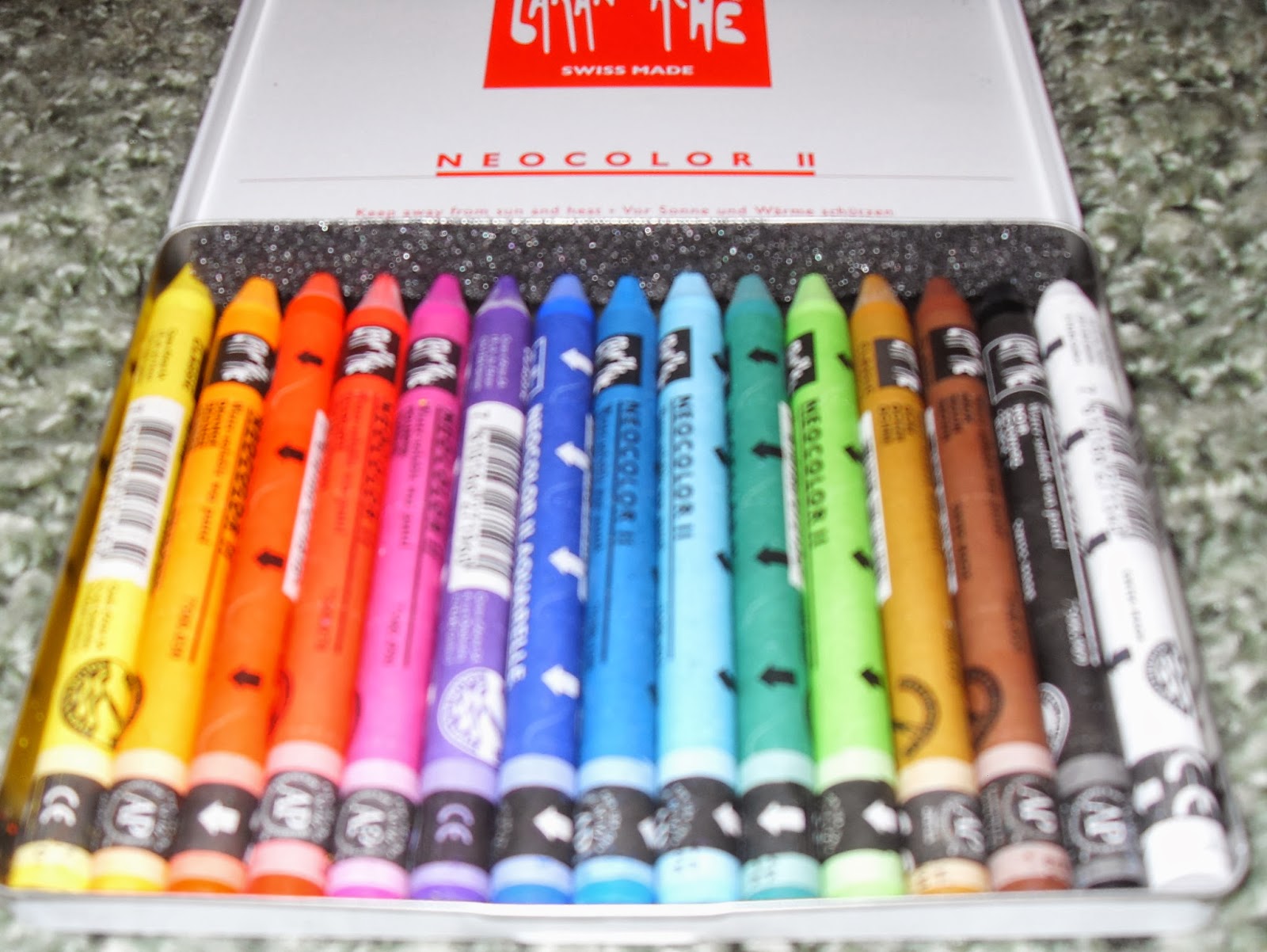
Wanting to try some new techniques, I enhanced some areas of the printed image with Derwent Inktense water soluble Ink Pencils, and Caran D'ache water soluble wax (crayon-like) pastels that were purchased on-line from Dick Blick art supplies. I had a blast "painting" with these water soluble pencils and crayons ... no rules... just play time :-D
I heat-set the image then fused it onto black ultra-suede. Inspired by Jennifer Day's extraordinary quilts at the Houston International Quilt Festival, I "thread-painted" over the entire image using several different colors of 40 weight, 50 weight, and monofilament threads. Hours and hours of time were spent on this part of the quilt, which was time well spent !
For the border area, I free-motion quilted various sizes of round "pebble-like" circles to give depth and interest. This quilting was done with 30 wt. Madeira rayon thread (my favorite of all the threads !)
This quilt was so much fun to make ! I was able to try new techniques, play with thread, and pay tribute to one of the strongest characters I've ever had the pleasure to meet - Sparky !
Alice's Strong Quilt--Strong Women
In Memory of Kathy; In Honor of Susan
I come from a family of strong women. Grandmothers, mother, aunts, sisters,
cousins—all strong in different and amazing ways. Our two daughters followed along in this
tradition. Until she suffered two
overwhelming and devastating bouts with depression, our oldest daughter Kathy
accomplished more in her 47 years on Earth than most people do in a lifetime. Our youngest child, Susan, is the woman I
admire more than any other. She juggles careers as a therapist and a part-time
university teacher with mothering her two active boys, being a devoted wife to
a wonderful husband, and somehow has time to be on a tennis team and participate
in competitive races.
Thus I chose to symbolize my strong daughters as
athletes. Kathy ran in several New York
marathons and kept on running almost daily for twenty years.
As a way to memorialize her sister, Susan then began running as well, participating in races with her husband and two sons. As a teenager, Susan was on her school’s
basketball team and played one year in college.
Because I am probably the most un-athletic woman imaginable, these athletic
abilities of my daughters have always astounded me and made me proud.
Of course, their other accomplishments out-shine their
athleticism, but depicting a runner and a tennis player was easier than
depicting a woman standing before a
crowd, speaking out for human rights; or one sitting counseling a troubled
soul; or a woman in a courtroom or a classroom; or a mother performing all the
myriad duties of motherhood joyfully—images of these overwhelmed my abilities,
and so I took the easy route with this quilt.
My Strong quilt is dedicated to my beautiful and strong
daughters—Mary Katherine and Susan Christine.
Their pictures are on the quilt’s back—Susan on the left, Kathy on the
right. The backing fabric is a
commercial one depicting young women swimmers.
There’s an inside joke here:
Kathy loved to give people nicknames.
One of the perhaps 10 or 15 she had for her little sister Susan was
C.O.W., which stood for Child of the Waters, because from an early age onward,
Susan loved so to swim! Kathy even made up a song she’d sing to Susan using
this nickname.
Construction details:
copy-right free coloring book images cut from black felt and fused onto
the background with Wonder Under; batik background fabric quilted in a grid
before the appliqués were applied.
| the back of the quilt |
| Close-up photos of Susan and Kathy--our wonderful and accomplished and STRONG daughters |
Sunday, January 12, 2014
The Next Word
TRANSLATE
In searching for my word, I decided that this word has the potential to be used to depict it in a fabric story.
Saturday, December 7, 2013
Artist Statement
Artist Statement
Jane Hartfield
I
am a contemporary artist who works with fibers.
I combine fabric and multiform fibers to create my art, using techniques
both old and new. As my creations have
developed over the years, it is evident that the beauty of nature and the interplay
of colors are my recurring and predominant themes--not always in the same
pieces!
Quilting
is an important part of all of my work, but it is treated as a design element
and an adjunct to the overall project. I
also incorporate felting, knitting, painting, fusing, and beading. I frequently create new fabrics by dyeing,
making silk fusion, painting fusible web or paper, melting fibers, or painting
on canvas. All of these techniques are
employed by me from time to time to translate my dreams and ideas into a fully
realized artwork.
All of the pieces I create are intended for
an audience. I want them to find a home on display in both residential and
commercial venues, where they may be seen, admired and, I hope, treasured by others.
Biographical Data
Jane grew
up in Winnsboro , LA. After attending college at Mississippi State
University , she married Jerry Hartfield, Jr. and moved to Memphis ,
TN. Jane and Jerry lived in Memphis 11 years and had a daughter and son before moving to
Fort Smith , AR in 1976. Jane went back to school at Westark Community College and graduated as a
registered nurse in 1979. She then worked in Labor and Delivery in a local
hospital for 21 years. After her nursing career, she worked for the hospital’s
volunteer organization, Sparks Guild, as assistant manager and then manager of
its gift shop. She retired from the gift shop in 2011 and is now working full
time as a fiber artist.
Although
Jane has not had formal art training, she has taken classes from many famous
quilt teachers and artists and has learned and used numerous techniques for
working with fiber in its many forms. Over the years she has sewn garments and
costumes, embroidered, knitted, crocheted, and quilted. Now she dyes fabrics
and yarns; combines quilting and machine embroidery; embellishes with beads,
shells and metal to produce original wall hangings.
Saturday, November 16, 2013
The Comfort Composite
Our own favorite fan and winner of "Most Helpful Husband" award, Randy Schormann, has done it again! Composed a lovely composite of our Comfort quilts. He even added a "place marker" for Janet, in the lower right corner. As usual, Randy had demonstrated what a true graphic artist he is in how he has chosen to arrange the quilts. Take a minute to study it. You can immediately see how almost every row of quilts has something that ties the quilts together. Truly, Randy is amazing!
I will wait to make postcards of this one, in case Janet does eventually come up with a comfort quilt. Meanwhile, I realize I've not yet made a Green postcard, so I'll do that soon and query all of you Mavens to see if you want me to order one or some for you!
Another great theme and wonderful results this time. My mind is already awhirl, thinking about Strong, and I do believe I had a brainstorm this morning for a potential design. Congratulations to all of you for a wonderful batch of "comforting" quilts!
This composite is "new and revised." After Carol posted her completed quilt, Randy substituted the completed quilt photo for the other one!
Subscribe to:
Posts (Atom)


++23.5wX28.25h.jpg)
.jpg)